 Sign In
 AI Tools
 Health
 Math
Math Everyday Life
 Finance
 Physics
 Chemistry
 Statistics
 Construction
 Pets
Pets Time & Date
Follow Us On:
Follow Us On:
Enter the dataset values into this box plot generator, and click 'Calculate' to create your box and whisker plot statistically.
Related
This boxplot calculator generates the visual box-whisker plot representation of the given dataset values. It makes the plot by pin-point five different statistical parameters such as (minimum, maximum, first quartile Q1, median Q2, and third quartile Q3).
“A box and whisker plot is a graphical representation that summarizes a set of data. It can be displayed along the number line, horizontally, or vertically”
The plot is a straight-forward way to compare the distribution of different data sets by representing the values side-by-side on a single graph. The box and whisker plot generator is the best tool that makes insightful comparisons and visualizes your data distribution.
Examples:

This graph comes from the five statistical terms below:
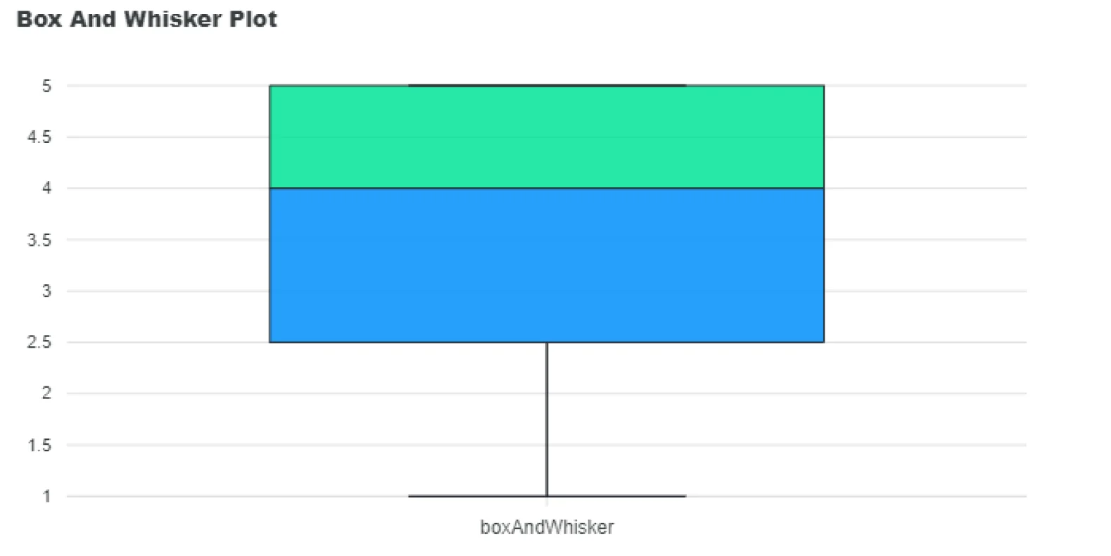
Let us suppose a dataset that is given as follows. So make a boxplot of this given set of values. Data set = 1, 2, 3, 3, 4, 4, 4, 4, 5, 5, 5
# 1: Order the dataset
The given values are already arranged in ascending order 1, 2, 3, 3, 4, 4, 4, 4, 5, 5, 5
# 2: Find the 5 number summary
| Maximum Number | 5 |
| Minimum Number | 1 |
| First Quartile | 2.5 |
| Median | 4 |
| Third Quartile | 5.0 |
# 3: Draw, label, and create a box
Rather than sketching the plot manually, our online box and whisker plot maker is a valuable tool that takes a matter of seconds to show a graphical analysis of your dataset.
In the box and whisker plot:
Outliers are data points that fall significantly outside the whiskers, typically beyond 1.5 times the IQR from the quartiles.
You can enter unlimited numeric values in this box and whisker plot calculator.
The whiskers extend from the outside of the box and go from minimum to lower quartile and maximum to upper quartile.
A box-and-whisker plot is a powerful visual tool for summarizing data distribution using five key statistics. With a box plot calculator, you can quickly analyze datasets, compare multiple groups, and detect outliers without manual calculations.
BBC Bitesize: Box and whisker plot
Khan Academy: Reading and Constructing a box plot
Related
Add this calculator to your site.
×Just copy a given code & paste it right now into your website HTML (source) for suitable page.
Preview:


Easter into Action, Save With Satisfaction
UPTO
50 %
OFF
Give Us Your Feedback
Share Result
Box Plot Calculator

Links
Home Conversion Calculator About Calculator Online Blog Hire Us Knowledge Base Sitemap Sitemap TwoEmail us at
Contact Us© Copyrights 2026 by Calculator-Online.net
How was your experience today?
Not now
Awesome! Would you mind sharing that on Trustpilot?
Your review helps others find a tool that actually works.
Write a Review on TrustpilotNot now
Sorry to hear that
Tell us what went wrong — we read every message.
Not now
Thanks for your feedback!
We'll use it to make things better.